It is important for me to use a specific and engaging font/graphic design for the movie's main titles in the opening scene and on Novikof's Solzhenitsyn book. I researched other text having to do with my movie's topics to get a feel for the conventions.
Spy and Political Thriller Typography:
In both movie posters, there are only 3 fonts. This is known as the three font rule and is similar to the three color rule.
Soviet Typography:
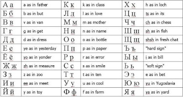
Russian is written in Cyrillic, which is a different alphabet from English. Some letters in Cyrillic might look like english letters, but are not. They aren't pronouced the same ways either.
Old Book Typography:
I looked at my old books from the 1940s and 1950s (the time when Solzhenitsyn wrote many of his books, including his most famous "A Day in the Life of Ivan Denisovich"). I found the font "Chenier" from www.fontspace.com and it looked very similar to what I was seeing. There was a distressed look to the font that hinted at text typed with a typewriter, like the ink is printed on the paper in irregular amounts.
My Typography:
Slogan: I used "Chenier" on the slogan's font as it looks like it was typed by a typewriter, hinting at Novikof's old books and the text that was still typed using typewriters in the 1980s (and in 1982, the setting of the movie). The text is not, however, a nod to how Novikof communicates or copies down intelligence, as he handwrites everything with a black calligraphy pen in black ink and in leather-bound journals or in his book The Complete Works of Solzhenitsyn. He feels that writing his thoughts in that book connects him further to the author and that Solzhenitsyn is the only person who understands him, until he meets Vetrov, of course.
Critic's Quote and Main Actor's Name: I've either used Courier New or OCR A Stnd for the critic's quote and main actor's name in yellow depending on the poster. I felt that Courier New was best for the first poster as it wasn't as long and the first one had its text scrunched up at the top. The second was better as OCR A Stnd as it looked bit more officially spy-like and had room for more space to be taken up.
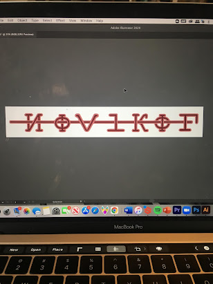
Main Title: I incorporated Cyrillic letters into my english spelling of "Novikof." At first, I used the backwards N in Cyrillic as the N, but it was too hard for people (I surveyed about 20 people) to read that way, so I flipped it back. The Os are Cyrillic characters, but look conveniently like a sniper sight, which goes along with the spy genre. There is no V is Cyrillic, so I created one using another symbol in Photoshop. I also didn't have an F, so I made the artistic choice to run a horizontal line through all of the letters to complete the F and then weaved that line through all of the former letters. This made me think of latitude lines on a map, also a spy tool. I added a stroke to all of the letters and the horizontal line and imported this into Adobe Illustrator, turning it into a vector and fixing any small issues.


No comments:
Post a Comment